I started Maltatype in early 2013, together with a couple of designer friends. Our main intention was for it to serve as a resource for anyone interested in the documentation of public-found typography around the Maltese islands.
Inevitably, our main focus went straight to shop signage. Even though this wasn’t an intentional focus, I was immediately drawn to the way that the type was often so beautifully designed and the signage so skilfully crafted, yet was more often than not, found gracing derelict, dilapidated buildings. The stark contrast between the dusty, peeling paint of the building and the beautiful, gilded type made me want to present the photographs documenting the shop-signs in a way that brought them to the public in a new light and thus, Maltatype was born in the form of a blog.
There wasn’t much in terms of local documentation, referencing local design available on the internet at the time, and even less which specifically focused on lettering. Working on degree assignments related to branding often led to students having to look at foreign sources for inspiration. That is what I was determined to change.
I believe that the typography on the signage, amongst many other elements forms part of a visual language that Malta speaks. All these elements combined, together with certain sounds and smells form part of a brand that IS Malta. What I want to do is capture the essence of one of the elements of that brand and put it out there as a resource, to serve as a building block for anyone who wants to build with it.
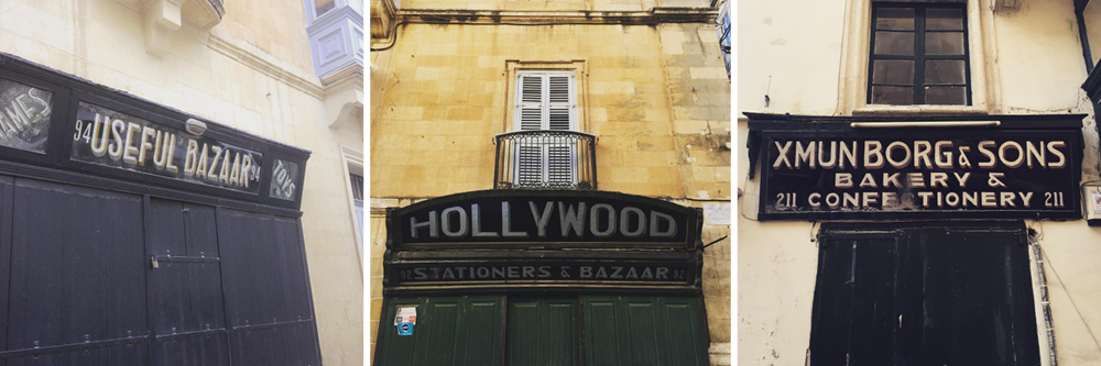
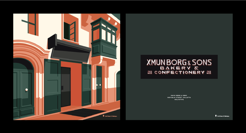
There’s an area at the bottom of Valletta’s Republic Street which plays host to what I refer to as “The Holy Trinity of Malta’s Shop Signs” comprising HOLLYWOOD STATIONERS & BAZAAR, USEFUL BAZAAR and XMUN BORG & SONS BAKERY & CONFECTIONERY (now Noni). These three unique shop signs feature some beautiful type all designed by the same sign maker. I believe that they were made by a gentleman named Carmel Bonello or “il-Bunell” who worked as a glider and had a gilding and sign-making workshop in Republic Str.
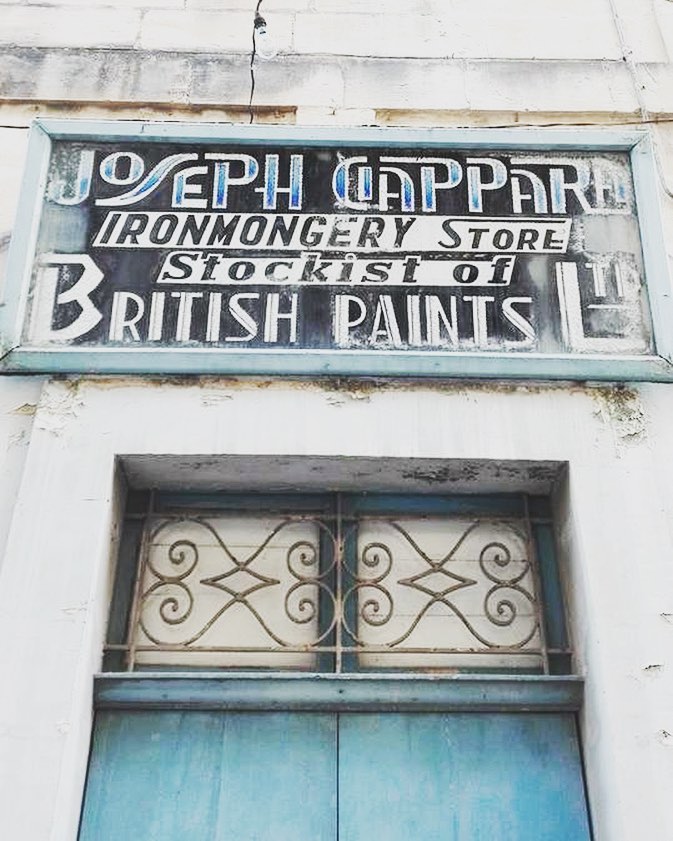
Another of my favorite shop signs has to be JOSEPH CIAPPARA IRONMONGERY STORE STOCKIST OF BRITISH PAINTS LTD in Triq San Pawl in Rabat. Unfortunately I don’t know much about the creator of this sign, however the typography that it features is so quirky and beautifully executed.
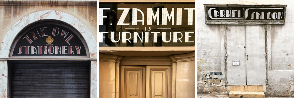
Some typography featured on signs that I absolutely love is a lettering style that is used by a certain C. GRECH from HAMRUN who has three very distinctive shop signs that can still be found in Valletta and Ħamrun. These are namely THE OWL STATIONERY in Valletta and F. ZAMMIT FURNITURE and CARMEL’S SALOON in Hamrun. These feature lettering made up of dark red and foil-backed stripes and have a very Art Deco-inspired style.
Follow: https://www.instagram.com/maltatype/